Yandex Practicum
Introduction
An international educational platform specialising in IT courses. Offers around 60 different programmes alongside numerous development teams.
My role was focussed on the "School Math" product. I was a part of an agile team, collaborating closely with another product designer and a UX writer.
Problems
- There was a high volume of customer support queries on post-registration stage.
- The product manager identified issues faced by parents:
- Confusion about next steps after registration.
- Failure to realise that they accidentally open a student accounts.
- Unawareness of the existence of student accounts.
- Lack of understanding that children need login credentials.
- Challenges with visual overload and scalability of the product. Adding new features increases the complexity of the service.

Business Impact
- High costs associated with customer support.
- We assumed that these problems had a negative impact on the number of referrals, users' attitudes towards the product and, as a resulting impact on LTV.
Hypotheses
- Implementing an onboarding process for new users will decrease “onboarding” customer support tickets from 52% to 20% within the first month.
- Simplifying the dashboard will elevate the Net Promoter Score (NPS) to above +55 within the first quarter following implementation.
- Simplifying the dashboard will increase user engagement among parents.
We’ll know this is true when the average number of sessions per parent increase by minimum 15% within 3 months after the dashboard redesign.
The challenge here was to find proxy metrics that are not affected by other product changes and market volatility.
Design Process
Adopted a methodology akin to the Double Diamond approach, encompassing:
1. Discovery
- Analysed user feedback. Found only a few messages mentioning the described problems. Without any details.
- Talked with customer support to grasp the specifics and frequency of user confusion.
- Requested data from an analyst. It confirmed that the issues were frequent and that there were a lot of related customer support requests.
- Collaborated with the product manager to formed hypotheses.
2. Analysis
- I analysed the issues and needs of both parents and students.
- Made and prioritised a list of job stories.
3. Ideation
- Researched competitors and services with effective onboarding.
- Drawed numerous wireframes, exploring potential solutions.
4. UI prototyping and detailing
- Designed a user flow for a future interactions. Including all potential states.
- Chose a direction for the design and step-by-step detailed wireframes into the final UI.
- Wrote UI copy in collaboration with the UX writer.
- Synced the vision with developers, UX writer and product manager during the design process.
- Documented a design solution.
5. Design review
Ensured the test server changes aligned with the design solution in collaboration with the QA engineer.
Solution
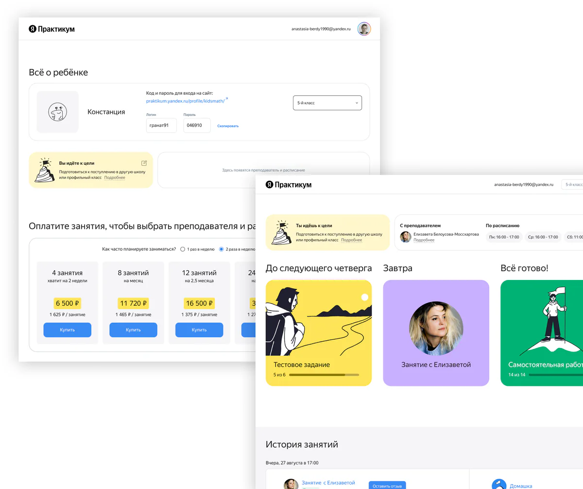
As a result, these are the solutions I came up with:
- Simple and phased onboarding. Previously, all elements were located on one page.
- Hid features that are rarely used, such as "Settings".
- Quick switch between parents' and students' accounts without the need for credentials.
- An indication that a user is currently in the parent's account.
- A dedicated block for sharing student login and password.
Extra
We decided to update the visual design to make the product competitive in appearance. And to make it more friendly and easier to understand.
Results
- Customer support tickets: 52% → 16% within the first month.
- NPS: +48 → +58 within the first 3 months.
- Average number of sessions per parent: increased by 7% within 3 months.
The goal was too ambitious.
Reflection and learnings
- We concluded that the level of parental involvement in the child’s learning process largely depends not only on the simplicity of the interface, but also on some other factors.
- Solving many problems at once was a mistake. We must try to break tasks into smaller iterations. Because this time the problems affected most of the service, and too much time was spent on design and development.
- Despite limited team resources, it’s still preferable to validate solutions on actual users. Even if through unmoderated usability testing.
Thanks for reading 😊
Feel free to contact me.